

A solid venture capital pitch deck is your startup's story, condensed into a powerful, 11-13 slide presentation. As expert Robbie LaMattina often advises, it’s your one shot to grab an investor's attention by clearly articulating the problem you're solving, how your solution is different, the market you're going after, and why your team is the one to make it all happen.
4 Key Takeaways
- Brevity is King: The ideal pitch deck is 11-13 slides. This forces you to be ruthless with your messaging and ensures investors can grasp your entire vision in just a few minutes.
- Traction Trumps Talk: Hard data like revenue, user growth, or signed letters of intent are the most convincing evidence you can present. Show, don't just tell.
- Narrative Meets Numbers: A compelling story hooks an investor emotionally, but cold, hard metrics (CAC, LTV, MRR) are what get them to write a check. Your pitch must masterfully blend both.
- The Team is the Bet: Especially at the early stage, investors are betting on the founders. Your team slide must build immediate credibility and show you have the right experience to win.
Your Blueprint for a Pitch Deck That Wins

Getting your pitch deck right is your foot in the door. This guide is designed to be your blueprint, showing you exactly what investors want to see in today's fundraising climate. Forget the fluff; we’re diving straight into a modern, effective structure.
This isn’t just theory. It’s about building a strategic narrative backed by hard data—something that’s non-negotiable in such a competitive space. To get a feel for what works, it’s always a good idea to study a few successful pitch deck examples before you start building your own.
What follows is a detailed, slide-by-slide breakdown, but first, let's get into the right mindset.
The Modern Investor Mindset
Venture capitalists are swimming in pitch decks. They see thousands every year, and the average investor spends just over two minutes on any given deck. That’s it. You have a tiny window to make an impression.
Your presentation has to be sharp, scannable, and hit hard from the very first slide. The goal isn't to answer every question they could possibly have; it's to get them excited enough to book a meeting.
To do that, your deck must instantly show:
- You have a deep understanding of a real, painful problem.
- Your solution is unique, scalable, and defensible.
- You have early traction or some proof that you're onto something.
- Your team has the right experience to pull this off.
Your deck is a storytelling tool first and a data repository second. It should build a narrative arc, from the initial problem to the ultimate vision, with your team as the heroes capable of making it a reality.
Think of your deck as the movie trailer for your business. It needs to be clear, compelling, and leave the investor wanting to see the full film. This guide gives you the script.
Before you even think about opening PowerPoint or Canva, let's talk about what actually makes a VC pitch deck work. It's not about having the slickest design or cramming in every single detail. A pitch that gets funded is built on a solid foundation.
Get these four principles right from the start, and every slide you create will be sharper, more compelling, and far more likely to get you that next meeting.
The 11-13 Slide Rule
Your most valuable asset here is discipline. I've seen founders try to tell their entire life story in 30 slides, and it just doesn't work. An in-depth analysis of 17,500 startup pitch decks found a clear sweet spot: 11 to 13 slides.
Go shorter, and VCs assume you don't have enough substance. Go longer, and their attention plummets. This isn't just a suggestion; it's a data-backed rule that forces you to be ruthless with your messaging. You can dig into the full findings on pitch deck effectiveness if you're curious.
Traction Over Talk
Ideas are cheap. Execution is everything. That same research pointed to two things that massively boost your odds of getting funded: showing actual revenue and listing existing investors. This is the essence of "Traction Over Talk."
If you have people paying you money, that’s your headline. If you have other smart investors already on board, that’s your social proof. This isn't just about showing progress; it's hard evidence that you've found a real problem and are on the path to product-market fit. To get your proof points nailed down, it’s worth diving into a strong product-market fit framework.
Narrative Meets Numbers
Investors are human—they get hooked by a great story. But they're also financial stewards, so they write checks based on cold, hard numbers. Your pitch needs to masterfully blend the two.
The story is what creates the emotional pull. It paints a picture of the future you're building and why it matters. The numbers are the logical proof that your vision isn't just a dream, but a viable, scalable business.
"Your story explains the 'why,' while your metrics prove the 'how.' An unforgettable pitch seamlessly integrates both, making your vision feel both inspiring and inevitable."
Every big claim you make needs a metric to back it up—market size, user growth, CAC, LTV. This balance shows you're not just a visionary; you're a pragmatist who knows how to execute.
Design for Clarity
Let’s be honest: your deck will be skimmed long before it’s ever read. That means your design has one job: make your key points impossible to miss.
This isn't about fancy graphics; it's about clarity. Think tons of white space, big fonts, and a simple, consistent color scheme. Every single slide should have one—and only one—main takeaway. This approach, which people like Robbie LaMattina have perfected, ensures your message cuts through the noise, even if an investor only spends three minutes with your deck.
A Slide-by-Slide Guide to Nailing Your Pitch
Think of your pitch deck as a story. Each slide is a scene, and your job is to guide the investor through a compelling narrative that ends with them wanting to be part of your journey. This isn’t just about listing facts; it’s about building a case, one slide at a time, so that by the end, their questions are already answered.
To get started, I always advise founders to frame their thinking around four core pillars. Get these right, and you're already ahead of the game.
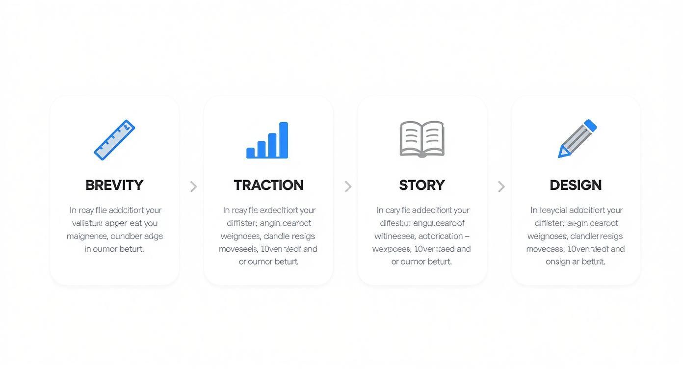
It’s a simple formula: a tight story, backed by real traction, told with a powerful narrative, and wrapped in clean design. When these elements work in harmony, you create something memorable.
Now, let's get into the nitty-gritty and break down the 12 essential slides that will bring your story to life.
Before we dive into the details of each slide, here’s a quick overview of the 12-slide structure we'll be covering. This table lays out the entire narrative arc, showing you the role each slide plays in building your case for investment.
The 12 Essential Pitch Deck Slides
| Slide Number | Slide Title | Core Purpose | Key Question to Answer |
|---|---|---|---|
| 1 | The Cover | Make a professional first impression. | Who are you and what do you do (at a high level)? |
| 2 | The Problem | Create urgency and empathy. | What painful problem are you solving? |
| 3 | The Solution | Introduce your product as the hero. | How do you solve that problem? |
| 4 | Market Size | Prove the opportunity is huge. | How big is the market you're targeting? |
| 5 | The Product | Show, don't just tell. | What does your product actually look and feel like? |
| 6 | Business Model | Explain how you make money. | What is your path to revenue? |
| 7 | Traction | Provide proof that you're on to something. | What evidence shows your idea is working? |
| 8 | Go-to-Market | Detail your growth plan. | How will you acquire customers efficiently? |
| 9 | The Team | Build credibility and trust. | Why are you the right people to win? |
| 10 | Competition | Show you understand the landscape. | Who are your competitors and why are you different? |
| 11 | Financials | Demonstrate you understand your business drivers. | What are your realistic financial projections? |
| 12 | The Ask | Clearly state your needs and goals. | How much are you raising and what will it achieve? |
This structure provides a logical flow that walks an investor from understanding the problem all the way to seeing how their capital will fuel your growth. Now, let’s break down how to build each one.
1. The Cover & Vision Slide
This is your handshake. It needs to be clean, confident, and get straight to the point. All you need is your company name, your logo, and a single, powerful tagline. That's it.
Your tagline is your entire vision condensed into less than ten words. It's the hook. Think about Airbnb's early tagline: "Book rooms with locals, rather than hotels." It immediately tells you what they do and who they're for. It’s clear, concise, and compelling.
Common Mistake: Don't clutter this slide with contact info or paragraphs of text. Let the simplicity and confidence of the design speak for itself.
2. The Problem Slide
Investors aren't in the business of funding cool ideas; they fund solutions to massive, expensive problems. This slide needs to make that problem feel real and urgent. You can do this with a relatable anecdote or a jaw-dropping statistic that makes them lean in.
Frame the problem so it feels both widespread and personal. Instead of a bland statement like, "Managing projects is inefficient," try something with teeth: "Teams waste 20% of their productivity juggling multiple apps, costing businesses millions in lost time."
Make the pain palpable. The goal here is to get the investor nodding along, thinking, "I've experienced that," or "I know people who complain about this all the time." When you define the problem well, your solution becomes the inevitable hero of the story.
This slide isn't about listing issues; it's about setting the stage and establishing the stakes.
3. The Solution Slide
After establishing the pain, your solution should feel like the ultimate relief. This slide explains what you do in the simplest terms possible. Now is not the time for technical jargon or an endless feature list.
Get right to the core value you provide. I’m a big fan of this simple formula: "We help [your customer] do [the job they need done] by [your unique approach]." For example: "We help remote teams stay aligned by bringing all their communication into one searchable platform."
This is where you clearly articulate your unique value proposition. If you’re struggling to nail this, it’s worth spending time on. There are some fantastic guides out there that break down what is value proposition in business and how to craft a powerful one.
4. The Market Size Slide
Here’s where you show investors that you’re not just solving a niche problem but are chasing a massive opportunity. A huge market is essential for generating the venture-scale returns they’re looking for. The classic TAM, SAM, and SOM model is the standard here for a reason—it works.
- Total Addressable Market (TAM): The entire potential market. (e.g., The global CRM software market is $120 billion).
- Serviceable Available Market (SAM): The slice of that market you can currently serve with your product. (e.g., The CRM market for SMBs in North America is $45 billion).
- Serviceable Obtainable Market (SOM): The portion of the SAM you can realistically capture in the next 3-5 years. (e.g., Our goal is to capture $100 million of the SMB market).
Be credible. VCs see these slides all day long and can sniff out inflated numbers from a mile away. Always use reputable, third-party sources to support your claims.
5. The Product Slide
Time to bring your solution to life. This is your chance to show the product in action, not just talk about it. It’s not about listing every single feature; it's about showing how your product elegantly solves the core problem you just spent time establishing.
Use beautiful, high-quality screenshots, mockups, or even a link to a short demo video (keep it under 60 seconds). Focus on the "aha!" moment—the key workflow that makes a user fall in love with your product. If it's a B2B dashboard, show the money-making insight. If it's a consumer app, show the core loop that keeps users coming back.
The visuals should do the heavy lifting here, making your product feel intuitive and real.
6. The Business Model Slide
So, how do you make money? Be brutally clear on this slide. Is it a classic SaaS model with monthly tiers? A marketplace taking a cut of each transaction? Or a straightforward one-time hardware sale?
Lay out your pricing structure clearly. If you have different plans or customer segments, show them. For instance:
- Basic: $29/month for individual users.
- Pro: $79/month for teams up to 10 people.
- Enterprise: Custom quotes for large organizations.
This slide proves you've moved beyond the idea stage and have a tangible plan for generating revenue.
7. The Traction Slide
Ideas are cheap, but traction is gold. For many investors, especially at the early stage, this is the most important slide in the entire deck. It’s the proof that you’ve built something people genuinely want and are willing to pay for.
Remember, traction isn't just about revenue. It’s any metric that shows forward momentum.
- Monthly Recurring Revenue (MRR) or user growth
- Glowing customer testimonials or logos of impressive early clients
- A long waitlist or signed letters of intent (LOIs)
- Promising results from a pilot program
The classic "hockey stick" growth chart is a staple for a reason—it’s a powerful visual. Show your key metric growing month-over-month to make your progress impossible to ignore.
8. The Go-to-Market Strategy Slide
A brilliant product is useless if no one knows it exists. This slide needs to outline exactly how you're going to find and win customers.
Vague statements like "We'll use social media" won't cut it. You need to show a specific, tactical plan.
- Content Marketing: Targeting high-intent keywords like "small business accounting software" to capture organic search traffic.
- Paid Acquisition: Running highly targeted LinkedIn ad campaigns aimed at CFOs in the tech sector.
- Direct Sales: Hiring two outbound sales reps to focus on enterprise-level accounts.
- Partnerships: Building integrations with complementary platforms like Shopify or Salesforce to tap into their user base.
This demonstrates to investors that you have a repeatable, scalable engine for growth.
9. The Team Slide
Early-stage investing is often a bet on the people. As the saying goes, investors bet on the jockey, not the horse. Your team slide is where you prove you have the right jockeys to win the race.
For each key founder or early hire, you'll want to include:
- A professional headshot.
- Their name and role.
- Two or three bullet points highlighting their most relevant experience. Focus on wins, domain expertise, and skills directly related to the startup's success.
This isn’t the place for their full resume. If your co-founder sold their last company or your CTO led a critical project at Google, that's what investors want to see. This slide is all about establishing credibility.
10. The Competition Slide
Every startup has competition. If you claim you don't, investors will either think you're naive or you haven't done your homework. This slide is your opportunity to show you understand the market and have a clear reason why you'll win.
A 2×2 matrix is the perfect tool for this. Plot your company and your key competitors on two axes that represent your core differentiators. For example, you might choose "Price" for the Y-axis and "Ease of Use" for the X-axis.
Your goal is to position your company in the top-right quadrant. This instantly communicates that you are superior on the two dimensions that matter most to your customers.
11. The Financial Projections Slide
Let's be honest: everyone knows your five-year projections are a guess. What investors are really looking for on this slide is whether you understand the fundamental drivers of your business and have logical assumptions.
Keep it simple. Present a three- to five-year forecast of the most important metrics:
- Revenue
- Number of Customers
- Key expenses (like R&D and Sales & Marketing)
- EBITDA
Avoid the temptation to paste in a massive, unreadable spreadsheet. A simple bar chart showing top-line revenue growth is far more effective. In the notes or on the slide itself, briefly explain your key assumptions, like your customer acquisition cost (CAC) and lifetime value (LTV).
12. The Ask Slide
You’ve told a great story; now it’s time to land the plane. This is your call to action, and it needs to be direct and confident.
State exactly how much capital you're raising and, just as importantly, what you’ll do with it. This "Use of Funds" breakdown shows you're a thoughtful operator.
- Funding Ask: Raising a $1.5M Seed round.
- Use of Funds:
- 40% Product Development (Hire 3 more engineers)
- 40% Sales & Marketing (Build out an initial sales team)
- 20% General & Administrative Expenses
This shows you have a clear plan to use their capital to hit your next critical milestones. End with your contact information, making it incredibly easy for them to say yes to a meeting.
Using Data and Metrics to Earn Investor Trust
Look, a great story gets an investor to lean in, but it’s the hard numbers that get them to actually write a check. Your narrative creates the "why," but the data proves the "how." This is the part of your pitch where you shift from being a visionary to being a credible operator who truly understands the levers of a scalable business.
For most VCs I know, the metrics slides are where the real diligence begins. They want to see that you've got a death grip on your unit economics and a clear, data-driven plan for growth. Without this, even the most inspiring vision feels like a total shot in the dark.
Key Takeaways for This Section:
- Focus on Core KPIs: Prioritize metrics like CAC, LTV, MRR, and Churn. Forget the vanity stuff. This shows you know what actually drives business health.
- Visualize Your Data: Keep charts and graphs simple and clean. Make your key data points pop. The classic "hockey stick" growth chart is a classic for a reason—it works.
- Prove Your Unit Economics: You have to show investors that your model is sustainable. That means proving the lifetime value of a customer is way, way higher than what you paid to get them.
- Ground Projections in Reality: Back up your forecasts with logical, data-supported assumptions. This shows you've thought critically about how you'll actually achieve that growth.
Beyond Vanity Metrics: What VCs Actually Care About
It’s tempting to brag about website visits or app downloads, but seasoned investors see right through those "vanity metrics." They don't prove you have a real business. Instead, VCs zoom in on the key performance indicators (KPIs) that signal a healthy, scalable model.
These are the numbers that really matter:
- Customer Acquisition Cost (CAC): Simple question: How much are you spending to get one new paying customer? This is all about marketing efficiency.
- Lifetime Value (LTV): How much revenue will a single customer bring in over their entire time with you?
- LTV to CAC Ratio: This is the magic number. A healthy ratio, typically 3:1 or higher, proves your business model is profitable and can last.
- Monthly Recurring Revenue (MRR): For any SaaS or subscription business, this is your lifeblood. It demonstrates predictable, compounding growth month after month.
- Churn Rate: What percentage of your customers are leaving each month? A high churn rate is a silent killer, even for a fast-growing company.
When you present these metrics clearly, you're signaling that you’re not just passively tracking numbers; you’re actively managing the core drivers of your business. This builds an incredible amount of trust and shows you have the operational chops to pull this off. As founder Robbie LaMattina often says, you have to take a data-first approach to prove any new venture is viable.
Weaving Metrics into Your Narrative
Just throwing a list of numbers on a slide won't cut it. You have to present them in a way that reinforces the story you're telling. For instance, if your MRR is taking off, show it on a clean bar chart that makes the "hockey stick" growth impossible to ignore.
When you talk about your LTV to CAC ratio, don't just state the number. Explain the why behind it. Maybe you discovered a new, super-efficient marketing channel that dropped your CAC, or you added a feature that improved retention and juiced your LTV.
Investors are increasingly demanding cold, hard evidence of market demand, revenue growth, and a credible path to scale. The best pitch decks have moved away from purely aspirational stories toward transparent, verifiable metrics. You can get more insights into what VCs will expect in the near future. This kind of data-backed storytelling shows you have the analytical rigor needed to build a massive company. For a deeper dive, using a solid startup financial projections template can help you organize and present this data with precision.
Common Pitch Deck Mistakes That Kill Deals
You've poured your heart and soul into building a narrative and gathering the data. But creating a winning pitch deck is a game of inches, and tiny missteps can lead to a swift "no." The final, crucial step is a ruthless audit to ensure you haven't fallen into one of the common traps that make investors tune out.
Think about it from their perspective. The average VC analyst sifts through 3,000 pitch decks a year but writes checks for maybe 9 of them. That’s a success rate of less than 0.3%. With odds like that, you can't afford any unforced errors. You can dig into more of these stats by exploring detailed insights on what it takes to succeed.
Let’s walk through the most common deal-killers I see time and time again.
The Sin of Information Overload
By far the most frequent mistake is trying to cram your entire business plan into 12 slides. Founders, in an effort to be thorough, create a cluttered mess. I'm talking about text-heavy slides, dense paragraphs, overly complex charts, and way too much jargon. This instantly signals that you can't distill your own vision into a simple, compelling message.
An investor might only spend a few minutes on your deck. They need to get it, and get it fast.
- The Wall of Text: If a slide looks like a page out of a textbook, you’ve already lost. Use crisp bullet points and short phrases.
- Confusing Visuals: A chart with ten data series and no clear headline is just noise. The golden rule is one key takeaway per visual.
- Insider Jargon: Ditch the acronyms and technical speak that an intelligent person outside your industry wouldn't immediately grasp.
Remember, the goal of the deck is to get the meeting. That’s it. You want to pique their interest, not drown them in details.
A Vague or Unconvincing Narrative
Another classic deal-killer is a story that just doesn't connect. It often shows up as a fuzzy value proposition or a complete failure to explain why the problem you're solving is so urgent. If an investor can’t quickly figure out what pain you solve and for who, their attention will drift.
"A great pitch deck tells a story. It has a hero (the customer), a villain (the problem), and a magical solution (your product). Without a clear narrative, you’re just presenting a collection of disjointed facts."
This is also tied to a lack of preparation. Sending a generic, one-size-fits-all deck is lazy. You have to tailor your pitch to a specific VC’s investment thesis, portfolio, and stated interests. It shows you’ve done your homework and that you actually respect their time.
Unrealistic Financials and Projections
Nothing screams "amateur" louder than baseless, wildly optimistic financial projections. Showing a "hockey stick" growth chart without any logical, data-backed assumptions behind it is a massive red flag. Investors know early-stage forecasts are mostly fiction, but they need to see that your thinking is grounded in reality.
As founder Robbie LaMattina points out, investors aren't just looking at the numbers; they're testing your fundamental understanding of what drives your business.
Here’s where founders usually mess up their financials:
- Top-Down Market Sizing: The classic "we'll just capture 1% of a $100 billion market." It's meaningless without a bottoms-up plan showing how you'll acquire those first customers.
- Ignoring Unit Economics: If you can't clearly articulate your Customer Acquisition Cost (CAC) and Lifetime Value (LTV), you haven't thought deeply enough about your business model.
- No Burn Rate Awareness: You have to show you understand your monthly expenses and exactly how the capital you're raising gives you enough runway to hit your next milestones.
Your projections are less about predicting the future and more about proving you have a sound, analytical mind for building a scalable company.
Key Takeaways
- Be Brutal with Brevity: Edit every slide down to its core message. Use strong visuals and minimal text to make your points instantly scannable.
- Tell a Damn Good Story: Your deck needs a clear beginning, middle, and end. Make the problem feel urgent and your solution feel inevitable.
- Ground Your Numbers in Reality: Build your financial model from the bottom up. Show your work and prove you understand the levers of your business.
- Sweat the Details: Sloppy design and typos are inexcusable. A polished, professional deck signals that you're serious and detail-oriented, which builds confidence.
Your Ready-To-Use Pitch Deck Template

Alright, let's get practical. Below is a text-based venture capital pitch deck template you can copy and paste right now to start building your story. This isn't just a random assortment of slides; it's a proven structure based on best practices from seasoned pros like Robbie LaMattina.
We've laid out the essential headings and prompts for each of the 12 core slides. Think of it as a blueprint that will seriously speed up your workflow and make sure you don't overlook any crucial pieces of the puzzle.
A Quick Word of Advice
Before you jump in, keep these points in mind. They'll help you get the most out of this framework.
- Trust the structure. There's a reason successful decks follow a similar narrative arc. Use this 12-slide framework to guide your story logically from start to finish.
- Fill in the blanks. We've included prompts for the specific data and story elements you need. Your job is to populate them with your metrics and insights.
- Make it yours. This is just the foundation. The real magic happens when you infuse it with your unique vision, hard data, and your team's authentic personality.
- Look ahead. Once your deck is complete, it becomes your primary tool for building a targeted investor list and preparing for the tough questions that will inevitably follow.
This template is your starting point. When you're ready to take your design to the next level, you can find a ton of great best startup pitch deck template resources to help with visuals and presentation.
A Few Final Questions, Answered
You've got the template down, but a few nagging questions might still be bouncing around in your head. It's totally normal. Let's tackle some of the most common ones I hear from founders so you can wrap up your deck with complete confidence.
What Is the Most Important Slide in a Pitch Deck?
This is the million-dollar question, isn't it? If you ask ten VCs, you might get a few different answers, but for an early-stage company, the consensus often lands on the Team slide.
Why? Because at the seed stage, investors are betting on you as much as they're betting on the idea. A killer team with relevant experience gives them the confidence that you're the right crew to navigate the inevitable storms and pivots ahead. Your idea might change, but a great team can adapt and execute.
Should I Include an Appendix in My Deck?
Yes, you should have one, but never attach it to your initial email. Your primary goal is to deliver a tight, compelling story in 11 to 13 slides. That’s it.
The appendix is your back-pocket resource for due diligence. It's where you can house the dense stuff—your detailed financial model, deep-dive market research, extra product mockups, or your competitive analysis matrix.
Have it ready, but only send it when an investor asks for it. This shows you're prepared and thorough without overwhelming them on the first read. It respects their time while signaling your professionalism.
How Do I Show Traction Without Revenue?
This is a classic pre-seed and seed-stage challenge. "Traction" doesn't have to mean "revenue." It’s all about proving that the market wants what you're building, even before anyone has paid a dime.
Think of it as collecting evidence. Here’s what powerful, pre-revenue traction looks like:
- User Engagement: Are people actually using your beta? Highlight your daily or monthly active users (DAU/MAU) and session times.
- Pilot Program Success: Showcasing fantastic results from early customer pilots is gold.
- Letters of Intent (LOIs): Getting potential customers to sign a non-binding LOI is a massive validator. It says, "If you build this, we will seriously consider buying it."
- A Massive Waitlist: A long line of people eagerly waiting for your launch is undeniable proof of demand.
- Key Partnerships: Landing a strategic partner can validate not just your product but your entire go-to-market plan.
As I always say, any data point that quiets the "Does anyone actually need this?" question in an investor's mind is a powerful piece of your story.
Is Sending My Pitch Deck as a PDF Okay?
A PDF is the classic, go-to format. It’s a safe bet. It works everywhere, your formatting stays locked in, and no one needs special software to open it. No investor will ever fault you for sending a PDF.
However, the game has changed a bit. Smart founders are now using secure deck-hosting platforms like DocSend or Pitch. These tools give you an almost unfair advantage by providing analytics. You can see who opened your deck, how long they spent on each slide, and who they shared it with. That kind of intel is invaluable for timing your follow-up and understanding what's resonating.
Ready to build a business that investors notice? At Robert LaMattina, we provide pragmatic insights on growth, strategy, and leadership to help modern professionals and entrepreneurs succeed. Explore actionable advice to refine your vision and scale your venture at https://robertlamattina.net.
Frequently Asked Questions
What is the fastest way to get a pitch deck rejected?
Cluttered slides packed with text. It's an instant killer. Investors skim, they don't read novels. If your core message isn't obvious within seconds, they're already moving on to the next deck in their inbox.
How important is professional design in a pitch deck?
It’s critical. Bad design, inconsistent formatting, or cheesy stock photos make your startup look amateurish. You don't need a work of art, but a clean, professional, and visually consistent presentation is table stakes.
Is it a mistake to say we have "no competition"?
Yes, it's a huge red flag. It tells an investor one of two things: you haven't done your research, or you're defining your market so narrowly that it's probably not a venture-scale opportunity. Every problem has an existing solution, even if it's just a manual process or a clunky workaround. Acknowledging the competitive landscape shows you're savvy.
How much should I customize a pitch deck template?
Treat the structure as a non-negotiable guide, but make the content 100% your own. The data, brand voice, and the story you tell are what will make your deck memorable. A template provides the skeleton; you have to provide the soul.